Parkour VR
This was a warehouse scale multiplayer VR experience built for Spree at Studio Liddell. The brief was to create a large procedurally generated game grid that could adapt to varying physical dimensions and accomodate up to a dozen or more players simulteneously. We wanted the players to feel like they were suspended on some kind of futuristic building that was still being constructed. Due to the physical constraints of the system we could not introduce verticality to the gameplay as this was logistically too much of a challenge given the development time, however, we did introduce the capacity for players to “fall” off the main area onto a lower drop-zone. Drones fullfilled part of the gameplay experience, shooting out floor tiles and flying through the gameplay space to obstruct players. Players also had to collect pickups to increase their score while avoiding damage that would deplete their score.
The game had to run on Oculus Quest and Pico G2 devices so everything was scaled to work on what is essentially high-end mobile hardware. This posed quite a challenge given the large amount of content that a typical map would present. We originally built things in Unity 2019.3 with the Universal Render Pipeline. But later had to down-grade the entire project to Unity 2018.4 and the legacy render pipeline due to poor Unity performance on Pico hardware.
I handled all the visuals for this project (see further down this page), as well as writing the main procedural map generating code in C#. The “Map Manager” was the main script, this handled the procedural building of the map by placing and rotating tiles in a grid like fashion within a set of given extents.
The map manager wrapped around a scriptable object that acted as a container for all the visual elements used for a given map. This allowed maps to be “skinned” thematically while retaining a given layout.
At the press of a button, the map manager script could ouput any number of random maps. In the final networked version of the game, this was handled by the server and passed to the clients as a simple set of prefab references and transforms.
The map manager also had the capacity to generate boundary objects - scaffolding in this case - that were eventually omitted in favour of the player teleport pads as seen above.
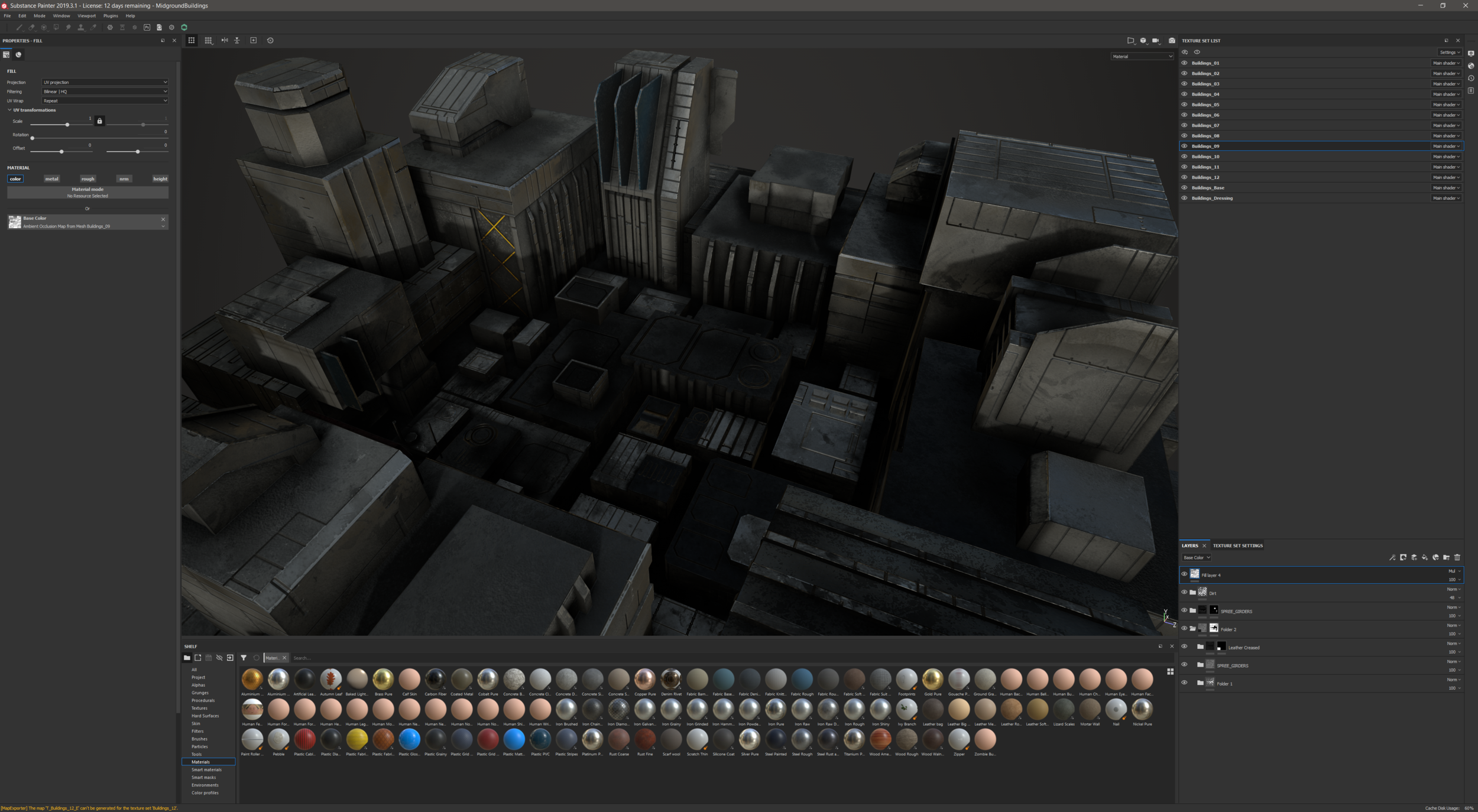
The environment was built up in 3 layers. The far-ground was a cube-map rendered with VRay in 3D Studio Max using a mixture of purchased and custom built 3D assets. The mid-ground was a custom built layer of static models surfaced in Substance Painter and rendered as part of the main Unity scene in realtime. The near-ground is the main playable area, built up as modular prefabs from individual model assets created in Max and surfaced in Painter.
The following images are renders from the background sky-box.
Here you can see the very simple model built for the surrounding buildings in the main level scene. The players wouldn’t be able to get close to these structures so detail was sparse. Initially I had a few materials setup to add variation into the surfaces, but had to sacrifice this in favour of optimsation in the later stages of development. All the lighting was baked in this region of the level as a further optimisation.
The main playable area was composed of prefabs, built using modular girder components to keep things as efficient as possible. Since these all used the same material, it meant that all the geometry could be statically batched at runtime. A small number of unique modular obstacles introduced enough variation to keep the space interesting and break up the visual uniformity.
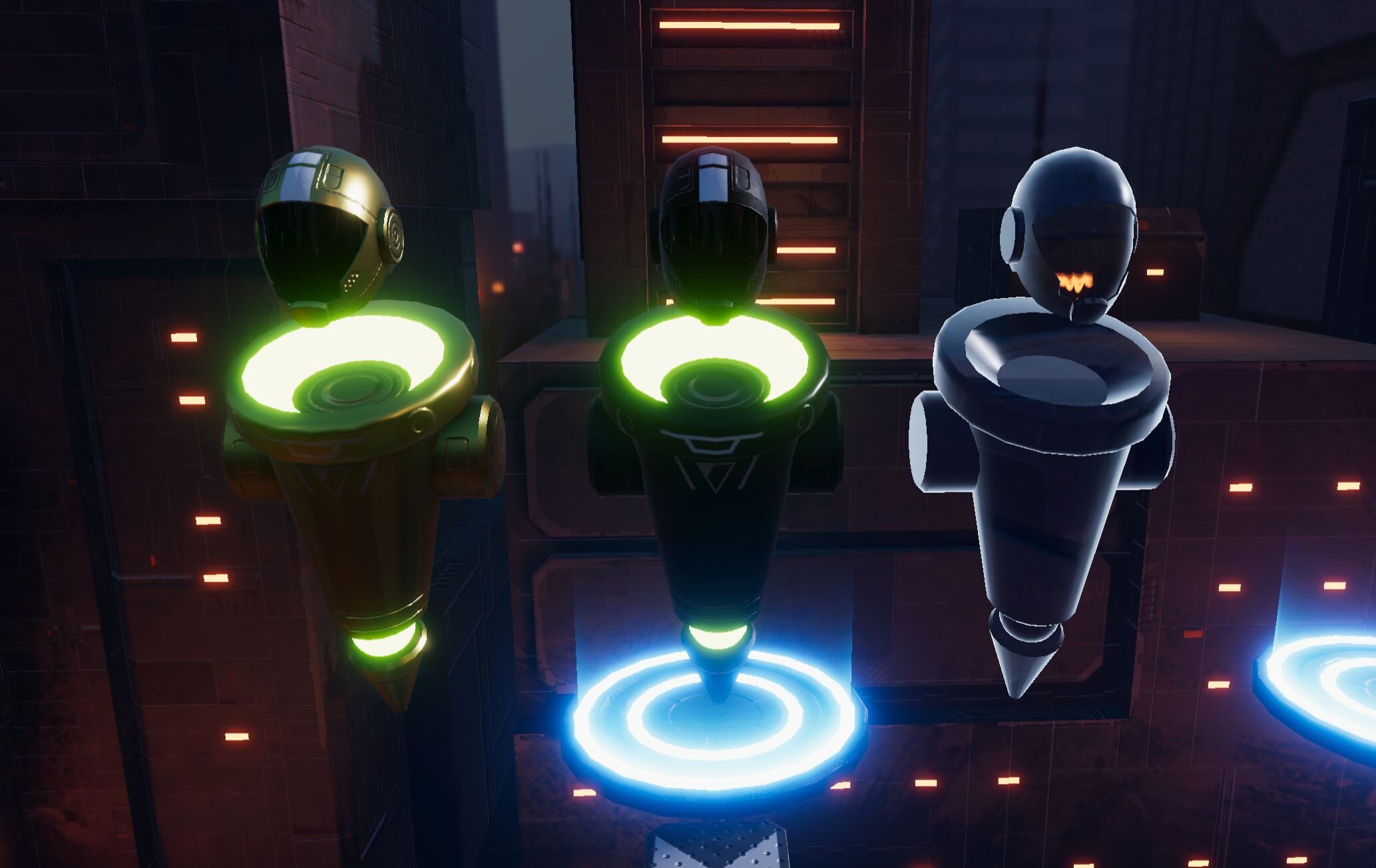
The player avatar models were quite simple. Since player tracking would not track hands and limbs, we had to keep the look of the avatars very simple. They would orient themselves to the general direction of travel and the helmets would orient to match the player headset. I decided on a levitating, robotic easthetic that would match the future city visuals. The glowing elements colour would be determined by the player colour in game. We also played with the idea of having very simple emotive “eyes” that would reflect current player status, but that didn’t make it into the final product.
A simple point scoring mechanic meant that players would be competing on a leaderboard. The winning player avatar would be switched out for the gold version shown below, and any players currently in the drop-zone would be represented by the simple ghost version.
I played around with the concept of each player avatar having some form of unique helmet adornments. Perhaps enabled in game as some form of reward.
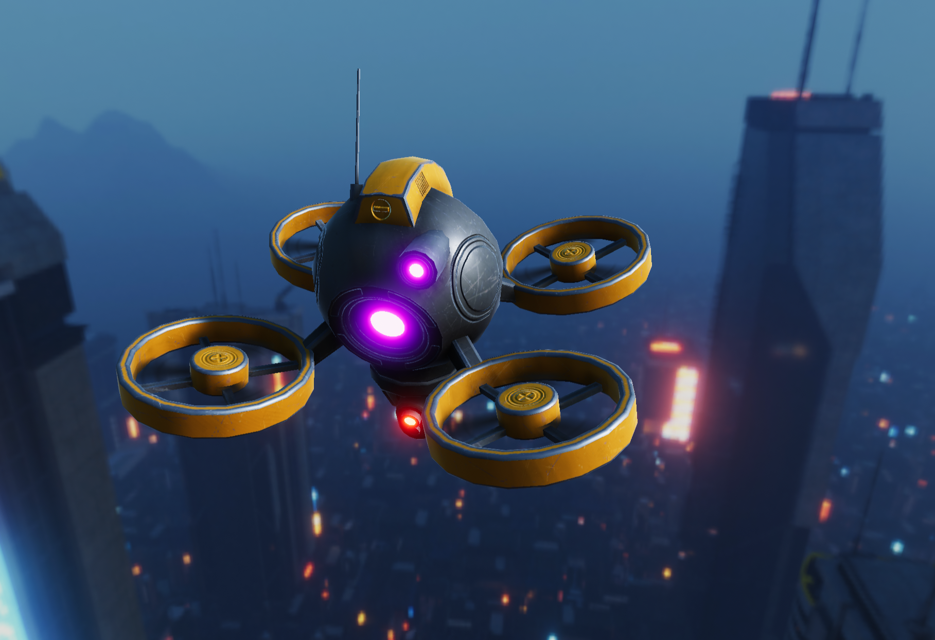
The drones were relatively simple also. I created a custom script that would orient the drone weaponry at the nearest / targetted player. The props were animated using a custom shader.
The drone shader also had the capacity to tint a single masked region to add further variation.


